Showing the value of a story
El Confidencial's paywalls had grown into a set of mismatched variants. I redesigned them, and we tested the new concepts against the existing wall to see which converted best. The existing wall won.
- Role
- Product designer
- Client
- El Confidencial
- Focus
- Subscriptions
- Year
- 2024
Context and design problem
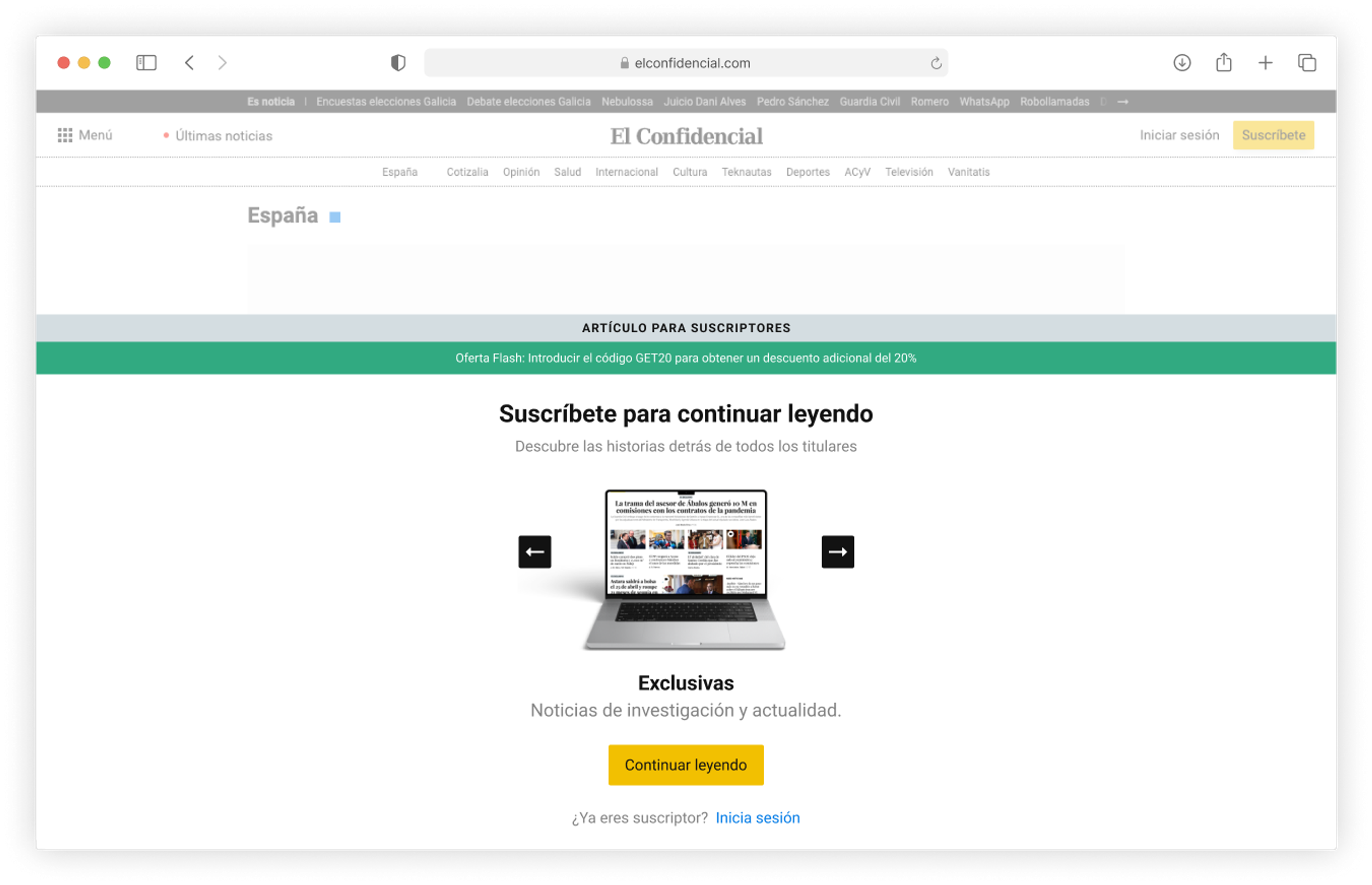
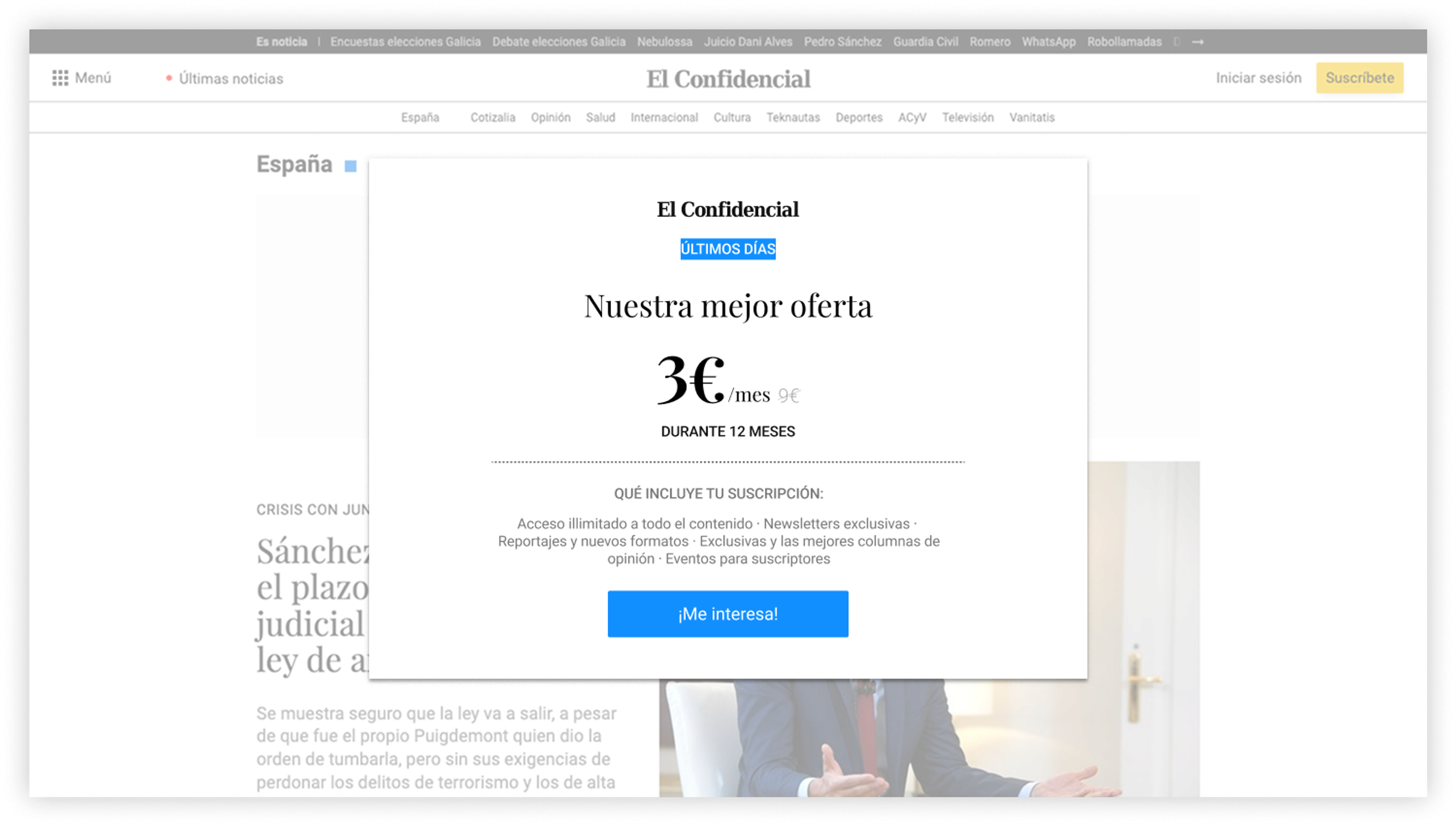
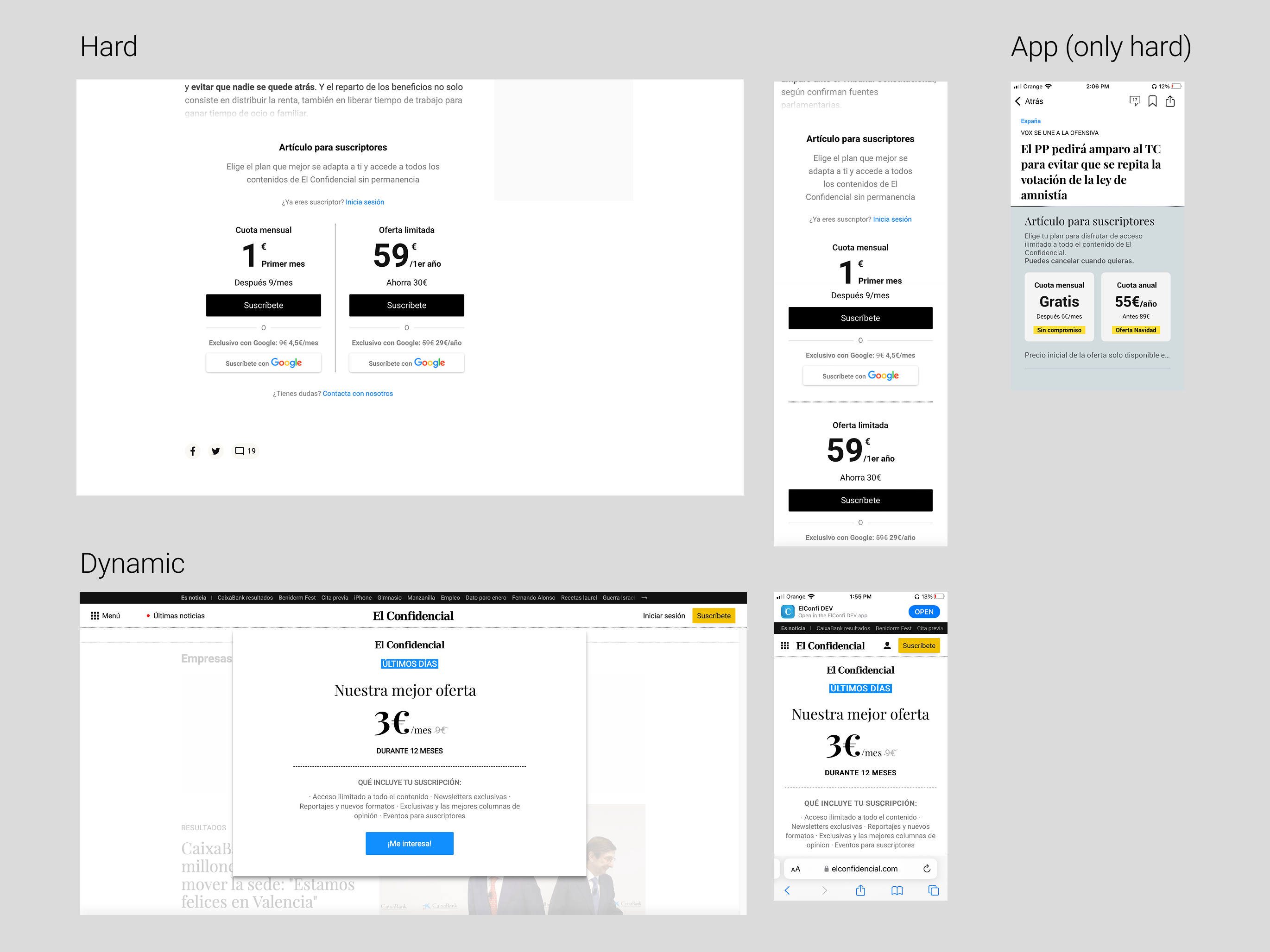
Over the years El Confidencial had built up several paywall variants, many of them made by the subscriptions team rather than by design. They didn't match each other or the design system. The brief was to bring them into one family and find out which way of presenting the offer converted best.
Research process
Audit of existing paywalls
The audit showed how many paywall variants were live, and how many had been built outside the design team.
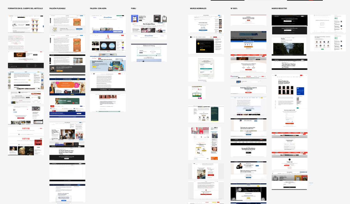
Benchmarking
Paywalls from US and European newspapers, grouped by format: modal, inline and banner.
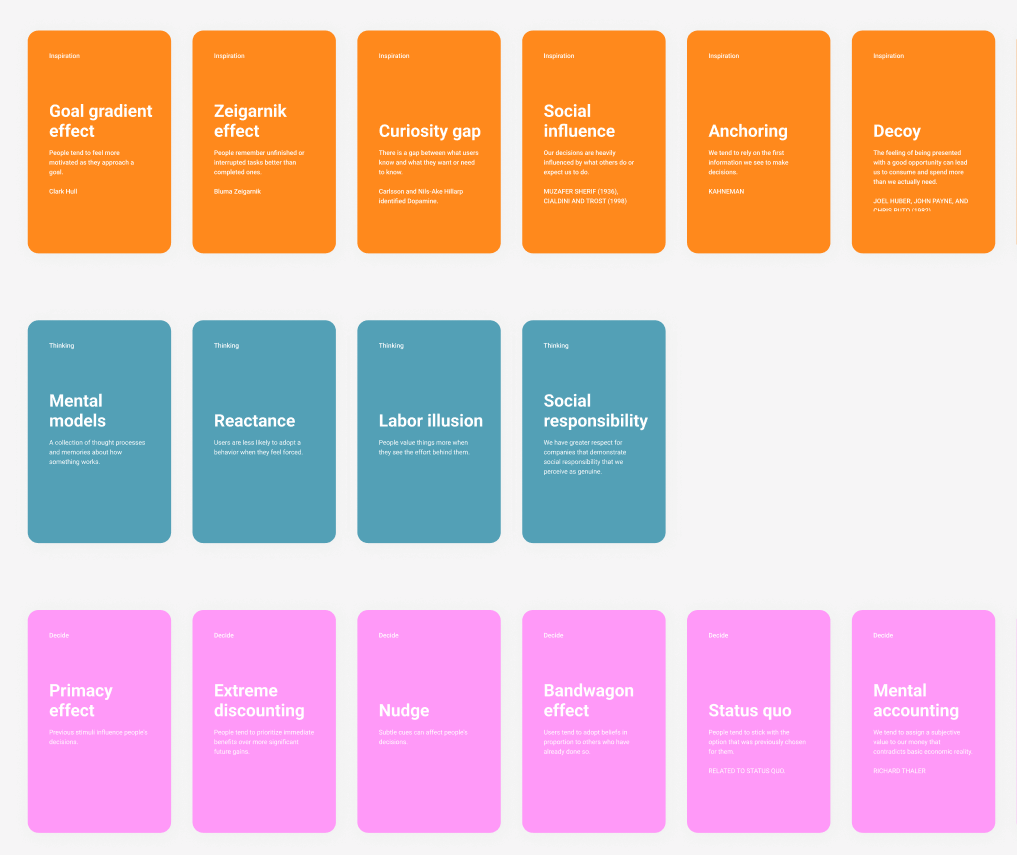
Behavioral design principles
Behavioral principles mapped to specific paywall decisions.
Key questions
Modal, inline, or banner?
A modal covers the article, an inline wall sits in the text and a banner sits at the bottom of the screen. Each placement changes how much the wall can say and how easily a reader can dismiss it.
Which value proposition converts best?
Do we lead with features, with what being a subscriber is like, or with an appeal to support independent journalism?
Direct payment or landing page?
A landing page has room to explain the offer, but it adds a step before payment.
How much content to show first?
Should the wall appear straight away or partway through the article? And if partway, how far in?
Personalized paywalls?
Should a reader arriving from Google Discover, who rarely subscribes, see the same wall as a loyal reader who is close to subscribing?
Microsubscriptions?
Could we sell a single article, or give one away in exchange for registering? What would that cost, technically and financially?
Designing the options
We designed each concept for desktop, tablet, mobile web and the app to find the edge cases. Reviews with stakeholders narrowed them down to three designs to test against the existing wall.

The concepts

Transactional
The simplest option: little more than the offer, in the hope that readers would go straight to the subscription page.

Simple value proposition
One plain reason to subscribe: how many subscriber-only articles El Confidencial publishes each week.

Social proof
The wall showed how many other people were reading the article, to suggest that others found it worth their time.
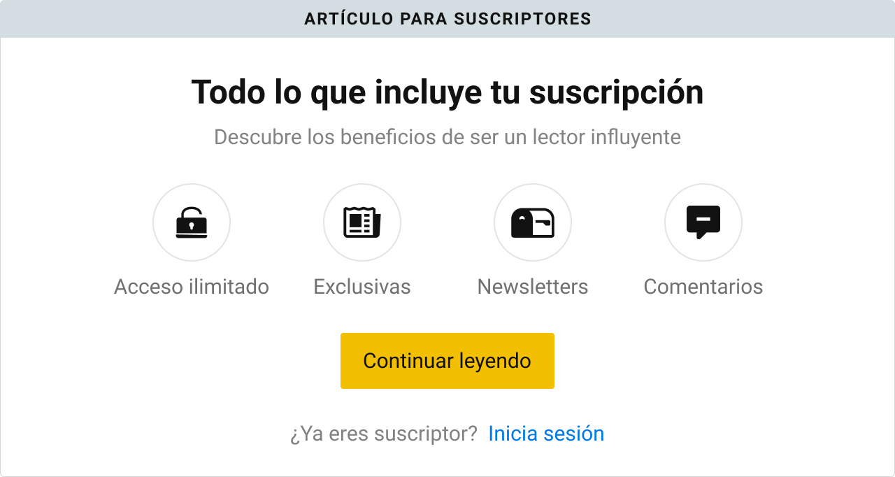
Subscription benefits
A list of what subscribers get: unlimited access, exclusive articles, newsletters and the ability to comment.
Test results
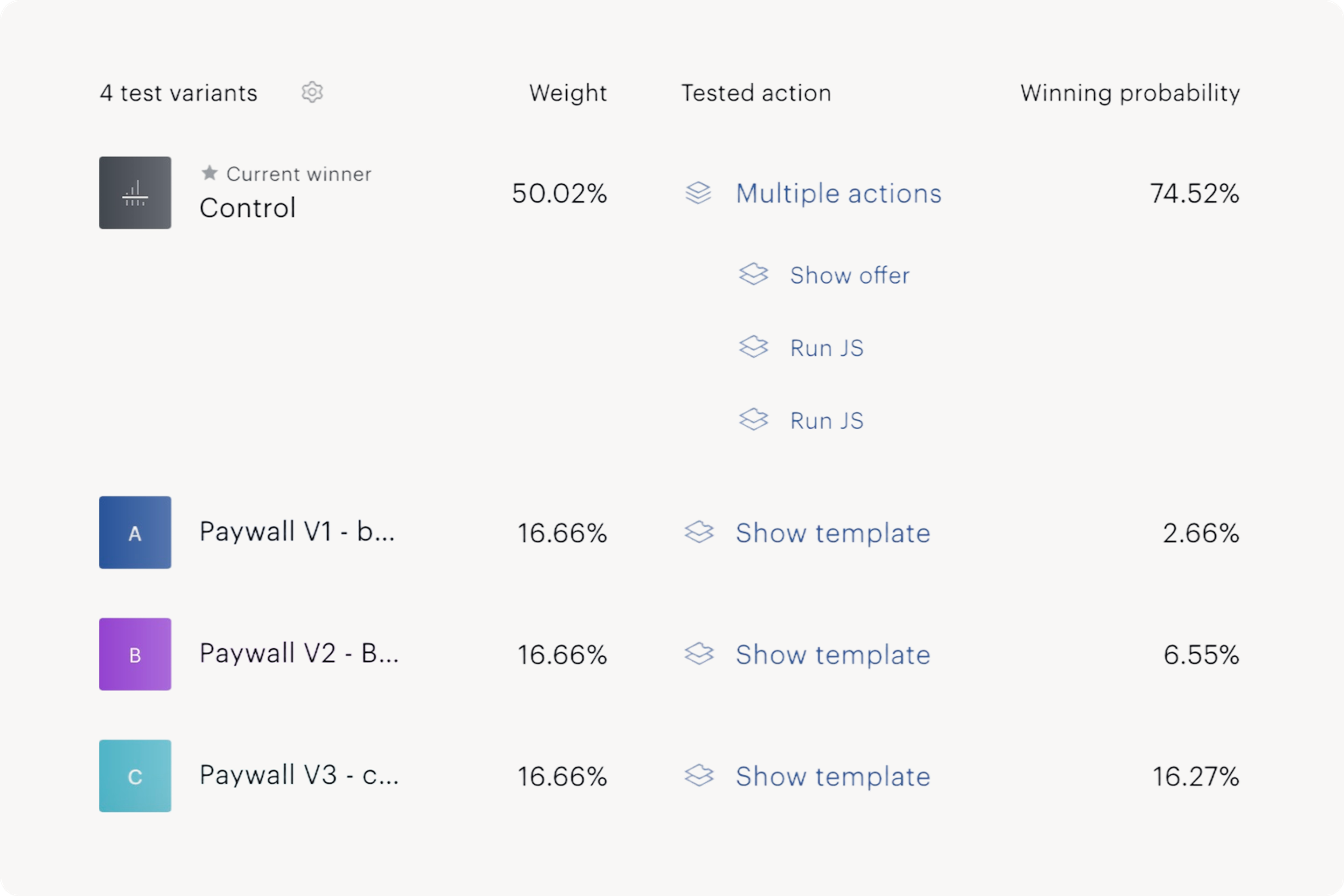
The control won. The existing wall, a plain comparison of the monthly and annual price, had the best chance of being the top performer, about 75% in Piano's model, ahead of all three new designs. The test ran in Piano from May 2024 across inline, banner and modal placements. The research behind the new designs was sound, and the simpler wall still did better.