ux audit | ux design | user testing
Subscription Checkout Optimization
Over roughly three months, I led the redesign of El Confidencial's subscription checkout flow — working alongside two other designers on research and two developers specialized in Piano, the enterprise subscription platform. We identified compounding UX errors through rage click data, device audits, and customer service logs, then systematically addressed them within Piano's significant technical constraints.

Before redesign

After redesign
Context and design problem
(hover to see UX errors)
The checkout flow is the most critical step in El Confidencial’s subscription funnel. Many readers are older and less tech-savvy, so the experience needed to be intuitive, accessible, and low-friction. I redesigned the checkout to increase completion rates while working within the significant constraints of Piano, the enterprise subscription platform. Piano uses a proprietary templating language that limits what designers can control: button styles, payment method ordering, field localization, and transition states are all partially or fully locked. Some friction points — like the forced payment method selection step and certain loading states — couldn’t be eliminated, only mitigated.

UX Errors: Mobile Checkout
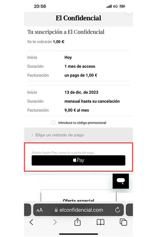
Apple Pay defaulted without user intent
Apple Pay was pre-selected by default, bypassing the credit card form entirely. While Apple Pay turned out to be surprisingly popular among older users, defaulting to it without user intent meant many landed on a payment method they hadn't chosen — creating confusion rather than convenience. The alternative payment selector appeared disabled due to its gray styling, further discouraging users from switching.
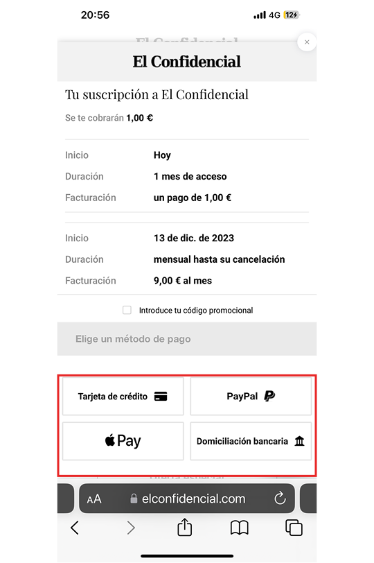
No default payment method adds an extra step
Requiring users to select a payment method before entering details added unnecessary friction. Button styles were inconsistent and low-contrast. Worse, switching methods cleared previously entered credit card fields, forcing re-entry.
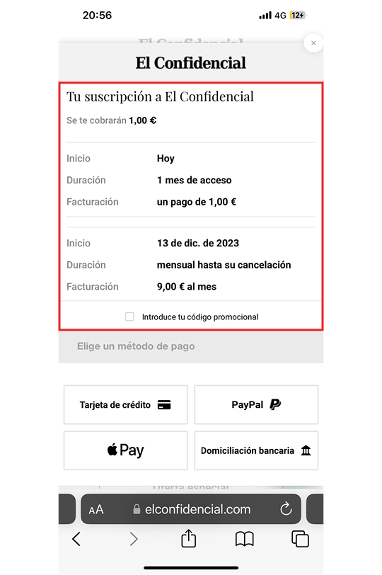
Confusing pricing information
Three different prices appeared — immediate payment, first-term cost, and recurring rate — without clear hierarchy. Users couldn't tell what they'd actually be charged, eroding trust at the point of purchase.
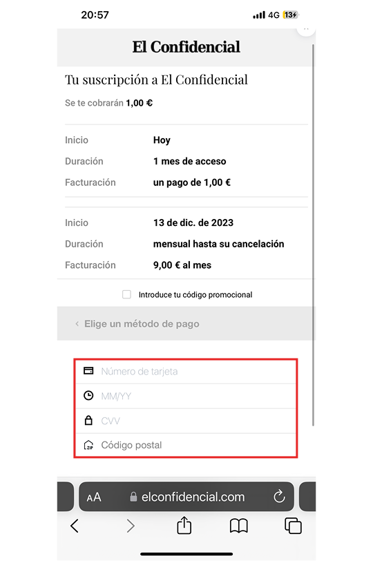
Credit card text fields lack autofill. Buy button obscured below scroll.
Credit card fields lacked autofill support, and the icons were inconsistent. Worst of all, the buy button was pushed below the fold, forcing users to scroll to complete their purchase.
UX Errors: Desktop Checkout
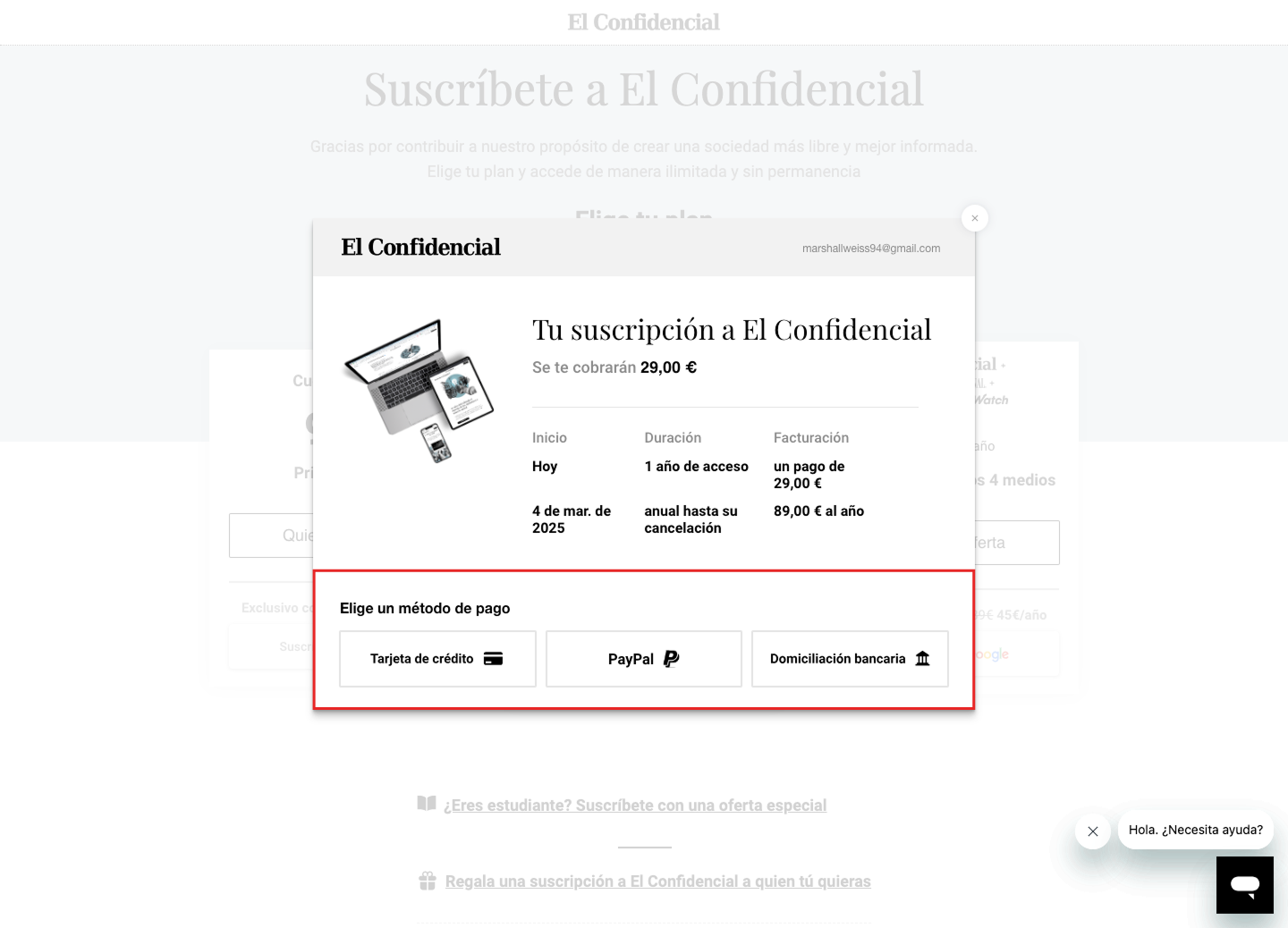
No default payment method
Users had to choose between credit card, PayPal, or bank transfer with no default selected — adding an unnecessary decision and extra step at the start of checkout.
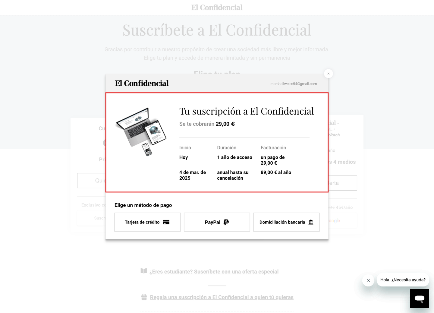
Confusing, overly textual pricing
Three different subscription prices appeared without clear distinction, and the modal didn't specify which plan the user was purchasing or what it included.
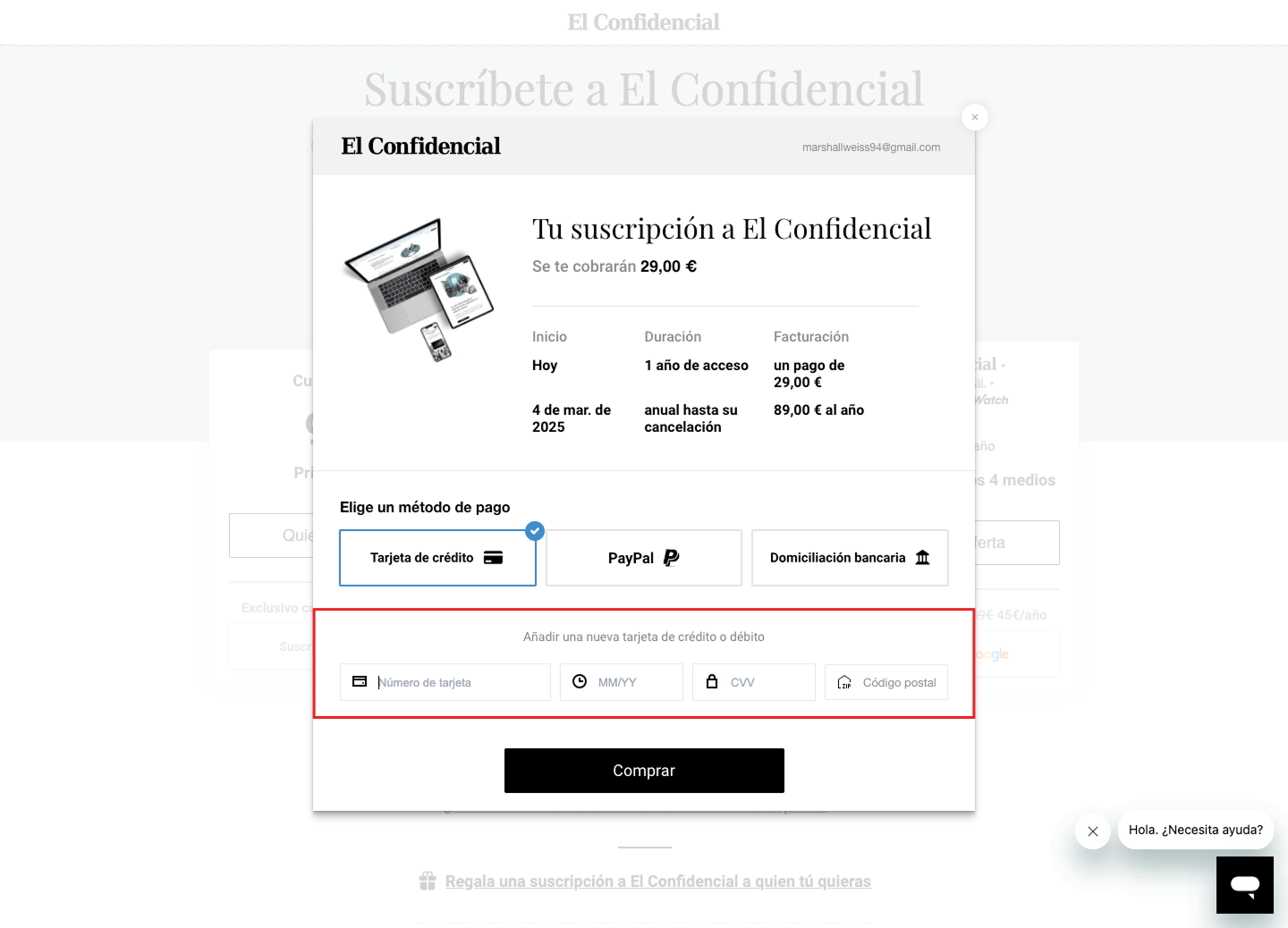
Inconsistent credit card fields
The credit card form lacked autofill and proper focus states. Icons were inconsistent and often wrong — a clock for expiration date, a house labeled ‘zip’ for código postal.
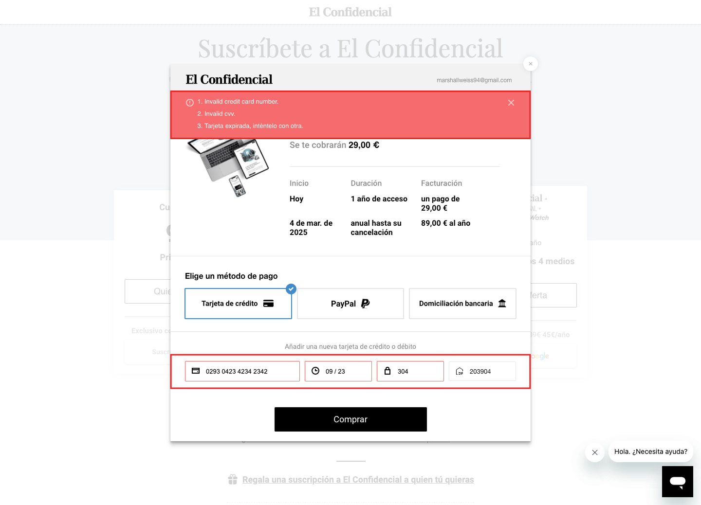
Incorrectly displayed error states
Validation only triggered after clicking ‘Buy’ instead of in real time. Errors appeared in an English-language banner at the top of the modal rather than inline beneath each field.
Research: Benchmarking
Research combined qualitative UX audit, behavioral data, and competitive benchmarking. We analyzed HubSpot rage click data and session recordings to identify drop-off patterns, examined how the flow rendered across device sizes to catch elements falling below the fold, and reviewed customer service logs for recurring payment complaints. We also benchmarked six major publications — NYT, Washington Post, El Mundo, El País, The Atlantic, and WSJ — alongside best practices from the Nielsen Norman Group and Baymard Institute.


Final Design: Desktop
The final design required close collaboration with developers to work within Piano's technical constraints. A key early decision was switching the payment provider to Stripe within Piano, which significantly improved the credit card form out of the box — better field styling, autofill support, and smoother mobile interactions — without additional front-end work.
Clearer pricing
I simplified the pricing to highlight only the discounted introductory price, displaying the original price subtly for context. This reduced decision friction and made the value proposition immediately clear.

Renewal terms hidden but easily accessible
Full subscription terms are accessible via a "Ver detalles" link, with a clear disclaimer about canceling anytime—reinforcing transparency without cluttering the main view.

Simplified promotional code flow
The promo code field is hidden by default and revealed via a checkbox, reducing visual clutter and eliminating unnecessary interaction friction.

Improved error states and real-time validation
Validation now happens in real time as users complete each field. Error messages appear inline in Spanish beneath the relevant input, replacing the previous post-submit English banner.

Buy button visible for all payment methods on mobile
Collapsible sections for subscription and payment details keep the buy button persistently visible on mobile, eliminating the scroll-dependency that previously hid it below the fold.

Outcomes & Takeaways
The redesign resulted in a 4.6% increase in checkout conversion rate. We shipped without A/B testing — the issues were clear enough from the audit that we committed to the full redesign and launched directly.
4.6% conversion increase
A marginal but meaningful improvement to the subscription funnel — compounding across millions of monthly visitors hitting the paywall.
The buy button wasn't even visible on mobile
The most impactful fix was also the most basic. On mobile, payment details pushed the buy button below the fold — users literally couldn't see how to complete their purchase. Trivial to fix, but a glaring error that compounded with every other friction point.
Switching to Stripe unlocked more than we expected
Moving from Piano's native payment fields to Stripe gave us better autofill, field styling, and mobile interactions out of the box. A constraint-driven decision that turned into the biggest single improvement to the credit card experience.
Customer service complaints dropped
Users found the new checkout noticeably easier to complete. The clearest signal: people stopped contacting customer service about being unable to finish their purchase.
Piano's constraints forced creative trade-offs
We couldn't rebuild checkout from scratch. Piano's templating language locked button styles, payment method ordering, and transition states. Success meant identifying which elements we could customize and accepting the rest.
Today I'd code it directly with AI
The biggest bottleneck was back-and-forth with developers over Piano's templating language. If I were doing this today, I'd use Claude to write the front-end code within Piano directly — cutting out that entire feedback loop.