product design | editorial strategy | rebrand
El Confidencial Home Page Redesign
For its 25th anniversary, El Confidencial rebuilt its home page from the ground up, alongside a full rebrand. As part of the design team, I helped move one of Spain's leading digital newspapers from a chaotic, section-based layout to a modular, topic-based design built for how people read today.
Why a Redesign?
The project sat at the intersection of external pressure, business strategy, and editorial ambition, and it had to launch in time for the paper's 25th anniversary.
External pressure
- Google Discover changes in Europe began favoring individual creators and YouTubers over media outlets, cutting a major traffic source
- AI-powered search shrank the window for readers to reach us, raising the stakes on direct visits to the home page
- Like the rest of the industry, we were shifting toward a subscription model that depends on a direct, loyal reader relationship
Business goals
- Ship a fully responsive home page, since we were the only newspaper in our sector without one
- Widen the layout to 1200px to support the new ad formats competitors were already serving
- Protect ad viewability and revenue through the transition
Editorial goals
- Move from a section-based layout to a topic- and story-based architecture, like the NYT and Washington Post
- Break up the relentless hard-news feel with a more varied mix to attract different readers
- Integrate video and photography, and cut the excessive scroll that buried our best work
Balancing competing needs
The hardest part of the redesign wasn't any single screen. It was balancing what every team needed from one finite home page, under outside pressure from a shifting Google, while still serving the reader first.
Product design
A modern, coherent experience
Key needs
- A fully responsive, multi-device experience
- Greater prominence for photography
- Expanded support for video, particularly vertical
- A cleaner, modern design competitive with peers
Research
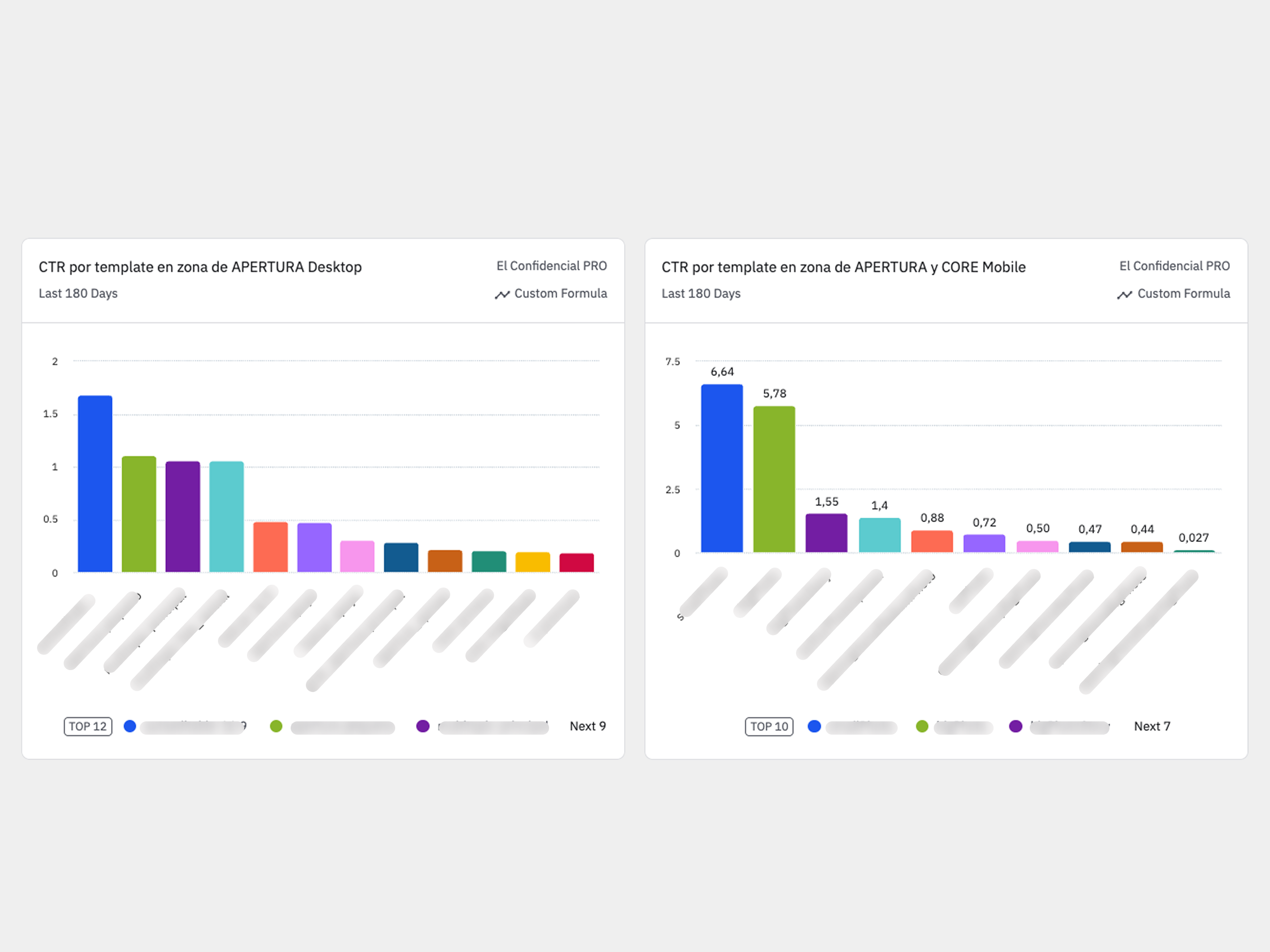
Template performance data
Click and engagement data across every home page template, used to identify what was working and what was being buried.
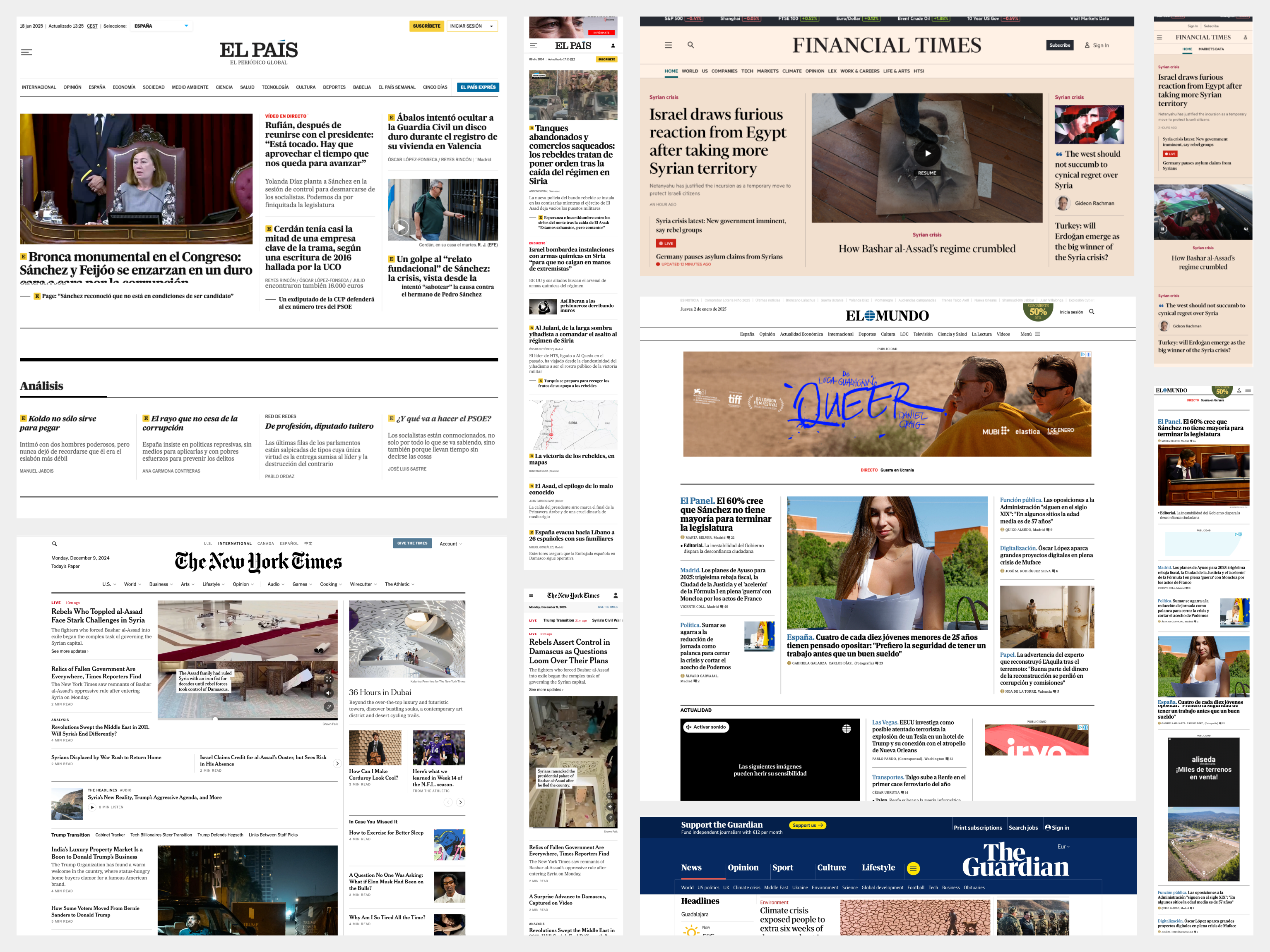
Competitive benchmark
Our benchmark board comparing how newspapers worldwide handle subscriptions, newsletters, opinion, live feeds, and video. [Add screenshot of benchmark board]
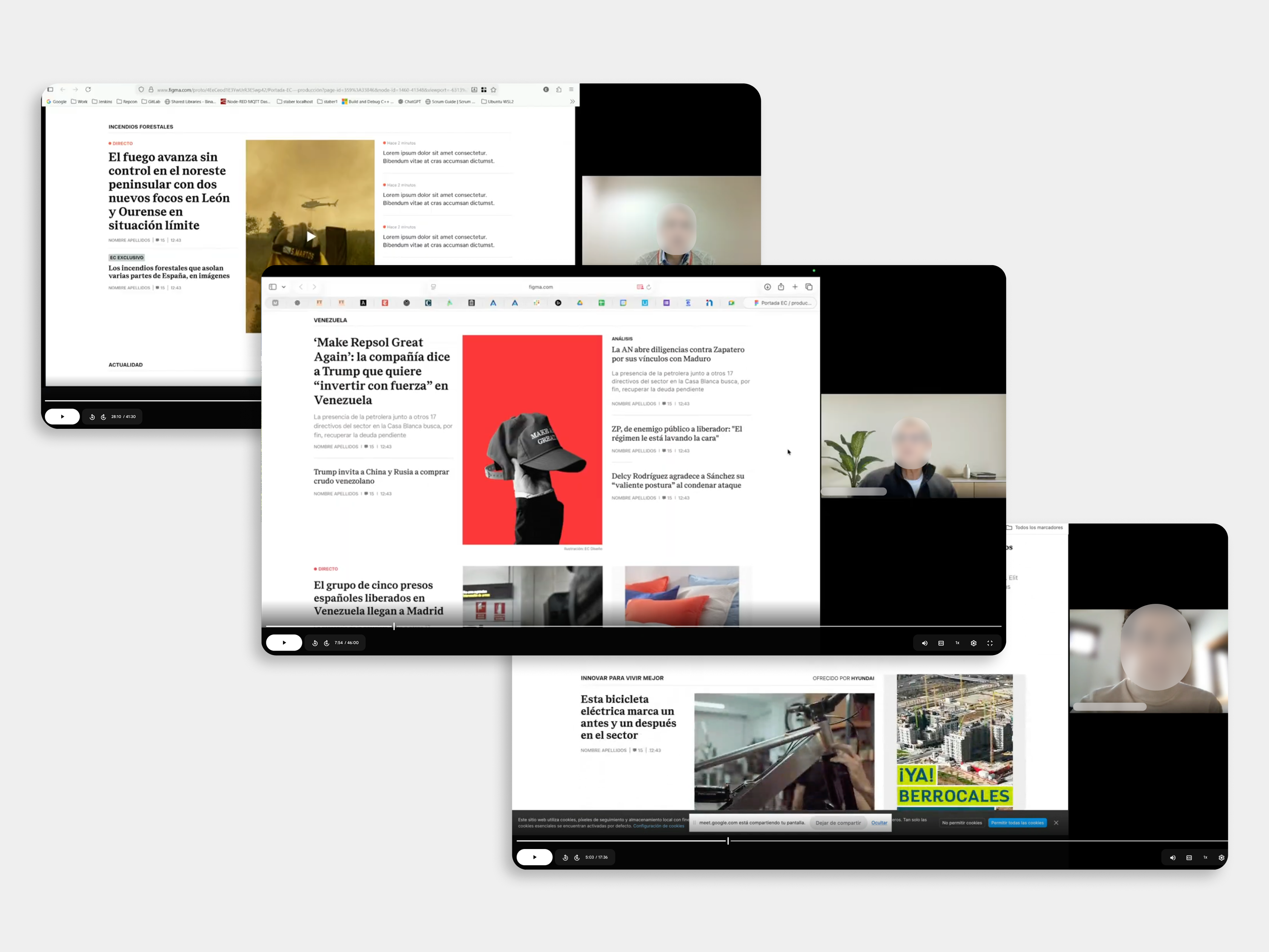
User interviews
User research sessions with readers seeking feedback on the new home page.
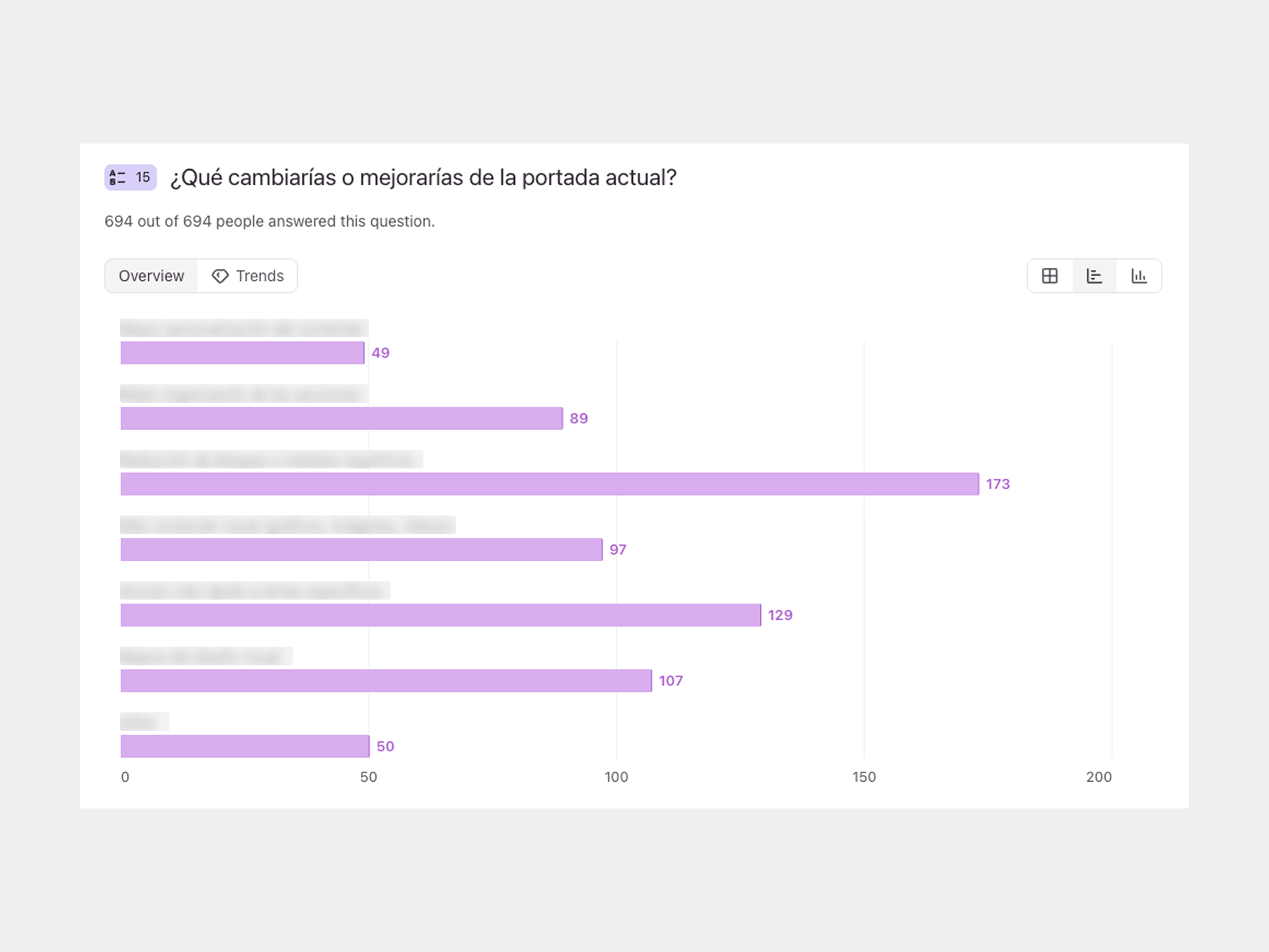
Survey results
Quantitative feedback on hierarchy, video, and the reading experience (survey items blurred to protect confidentiality).
Insights
Topics beat sections
Readers think in topics, not sections, so gathering a whole story in one place validated the core bet.
Bylines drive subscriptions
Columnists are the product and the top reason readers subscribe, so we made opinion a headline asset, not a footnote.
Opinion needs a predictable home
Readers want opinion in a fixed, findable spot that still lets day-relevant pieces rise with the news.
Readers just want to read
Readers pay for a calm, clickbait-free read far more than for new features.
Legibility is non-negotiable
With an older audience, legibility is non-negotiable; the light gray entradillas and tiny pildoras drew complaints.
Hierarchy from position, not photo size
Readers click headlines and read importance from position, not photo size, so placement and type drive hierarchy.
The personalization paradox
Readers say they don't want personalization, then ask for it, and the one personalized module gets the most clicks by far.
Less appetite for video than expected
Appetite for video was low, with vertical TikTok-style clips rejected almost unanimously; only produced explainers landed.
Smoothness beats tricks
Fewer pop-ups, smoother login and payment, and lighter ads retain readers more than any new feature.
Adapting to modern reading habits
The deeper question wasn't how to make the page prettier. It was whether organizing the news by section still made sense. We wanted the home page to adapt to how people read today: to attract new, loyal readers who would pay, and to improve the qualitative experience of reading on the site. That meant organizing content more by how people think naturally, around topics and relevant information, rather than around traditional sections, which are largely a holdover from print.
Judges see Sánchez entrenched if he is charged
Cracks in the PSOE: the drift challenging Sánchez
Leire's cleaning contracts span 12 PSOE town halls
The deal extending Almaraz to 2030 defies the government
€1.447B in revenue from Valencia's F1 plan
Russell and Hamilton chase an upset at Montmeló
Brazil disappoints on debut; Vini saves Ancelotti
Oyarzabal in the Golden Boot race, behind Mbappé and Kane
A modular template system
Early on I proposed building the page from a small set of consistent, modular templates rather than bespoke layouts. Each template aligns an article vertically or horizontally, varies the image aspect ratio, and sits within a column-based grid, unified by a clear type hierarchy with distinct headings for each template. The goal was a system that was modular, versatile, and simple. Getting the balance of those three was the hard part.
Opening template
Banner
Topic and issue architecture
The page is built around issues, not sections: a curated opening and a sequence of issues, each a lead story with its supporting context, then highlighted sections like economy and politics. Secondary sections fill in automatically. Because an issue isn't bound to a section, a big story can rise to the top and later drop back, letting editors reorder, test, and eventually personalize modules.

Top to bottom
New homepage, new branding
The redesign launched alongside a full rebrand: a new logo, color system, and custom typeface, developed by an external consultancy.
The redesigned home page
A guided tour of what changed, and why

Key changes
Results
In the first week after launch, we compared the new home page against the previous one, week over week. The early data was encouraging, with a few clear risks to watch.
More time and attention
Engagement time per page rose about 10% and average time on page about 7%, with bounce edging down. Readers stayed longer and read more closely, the qualitative win we were after.
Recirculation dipped, the risk to watch
The trade-off: the homepage sent fewer readers into articles, with recirculation down roughly 12%. The drop concentrated on desktop while mobile held steady. A more qualitative homepage can loop readers less from home to article and back, and it's the metric we're watching most closely.
Revenue held
Despite serving fewer ad impressions, homepage ad revenue stayed essentially flat, carried by higher CPMs and better ad viewability. A better reading experience that didn't cost revenue.
Clearer and cleaner
In interviews, readers found the hierarchy clearer and the page cleaner and more legible, which matters for our older audience.
Fewer articles, an SEO risk
The new page carries far fewer articles, and many of the ones cut were SEO pieces, raising a real question about Google discoverability that we'll keep watching.
What we're watching
Recirculation and template click-through, especially on desktop and in secondary sections, plus SEO rankings, ad viewability and load times, subscriptions, and direct reader feedback. A few full post-launch weeks are still to come.